Introduction

About WebTodi

WebTodi was created for secondary school students and recent graduates who need help searching for and applying to Universities. We allow students discover schools that match based on what’s important to them – location, majors, cost, career outcome, campus life, and more. With the pilot of our new product, we planned to solve the problems below in 6 months. The feedback we’ve received from students has been breath-taking.

Our Roles

Marcus – Creative Lead | Walter – Web Design

As a co-founder of the startup, Walter led the design, user testing, and development team on this project from end to end. Marcus was instrumental on all the graphics and the user experience of the platform. We collaborated with Product Manager (Ema) and Business Analyst (Debra), throughout the entire project.

Problem

Discovering the problem statement and solving for real users

Across our main target markets in Africa, the University admissions process has become a confusing and difficult road to navigate, with our surveys revealing that some students don’t even think about university until their final year of secondary school. Not to mention, most families are grossly under-resourced. We also found that there were very few platforms in Africa that catered to this very pressing need. Families that can afford to, use agents to get this service for their children, but these agents are overpriced!


Little to no prioritization: Priority isn’t placed on higher education until students are nearing the end of their secondary school journeys.

Example: Several students complain that they are not exposed to good choices early.

Impact: Students have to rely on what their parents/agents discover for them.


Financial Capabilities: A lot of families are limited by finances when searching for universities for their children. This causes the search to be tedious.

Example: Students only apply to universities they can afford due to lack of exposure, leading to limited opportunities.

Impact: Students miss out on scholarships and grants offered by higher education institutions.


Biased agencies: Agents favor certain universities due to their long-term relationship with them.

Example: Agents are not consistent across board. The information received by students is mostly incomplete.

Impact: Students are not exposed to the best opportunities available to them.


Defining the problem

“How could we design a solution that gives students and parents more clarity and direction when planning for the future.”
Goal

Help students prioritize their higher education early

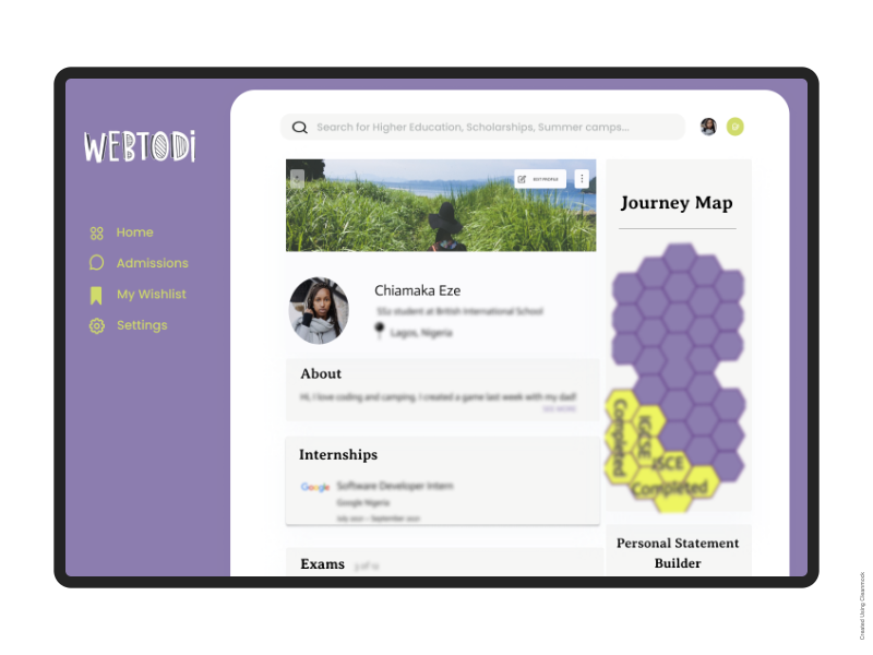
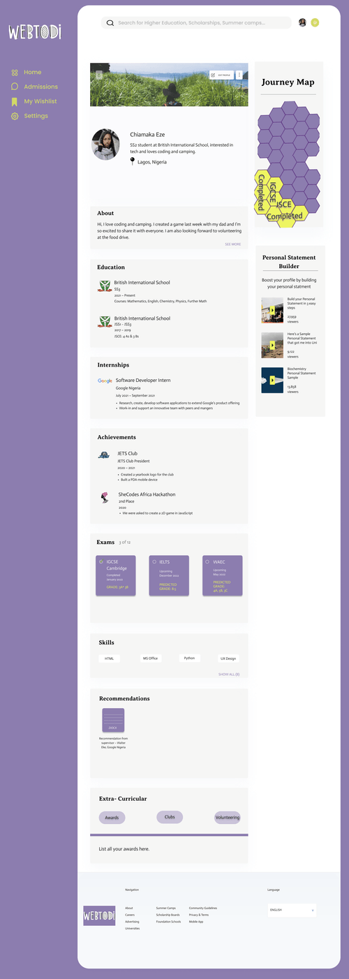
To create a platform where students can build their higher education profile and begin to seek out connections with higher education institutions and agents directly. This will allow them to know each other on a granular level, showcasing the qualities of each student and institution.

Give families direct access to scholarships and grants

With the financial limitations of a portion of our target market, we understand the importance of finding scholarships available and presenting the requirements for families to work towards achieving. This important feature of our solution will give our users an edge when applying.

Expose opportunities that are based on student criteria

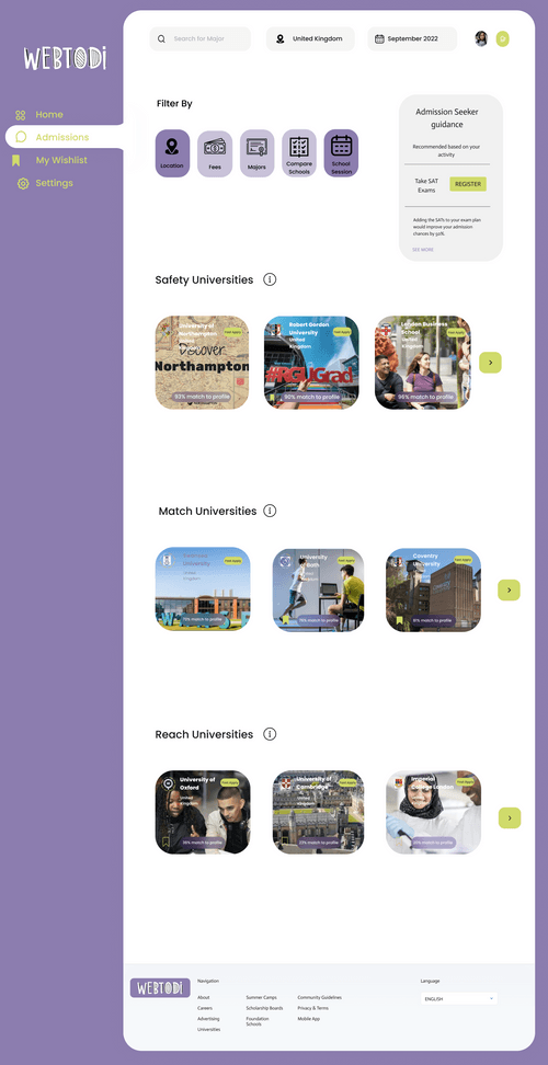
To optimize the opportunities for our users, we are putting the criteria in their hands. Searching for universities will include important filters that are applicable to each student, creating a personalized experience.

Impact

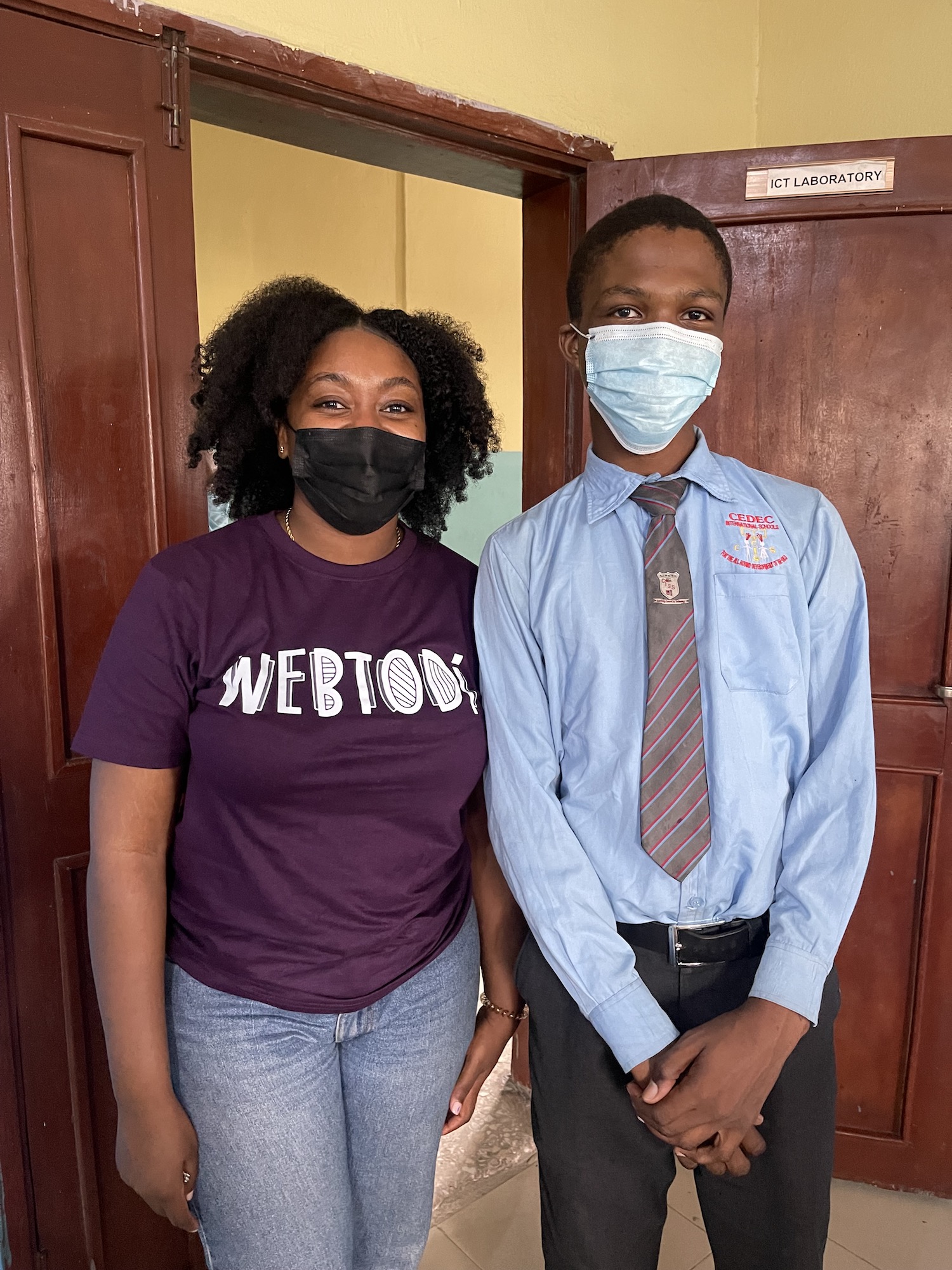
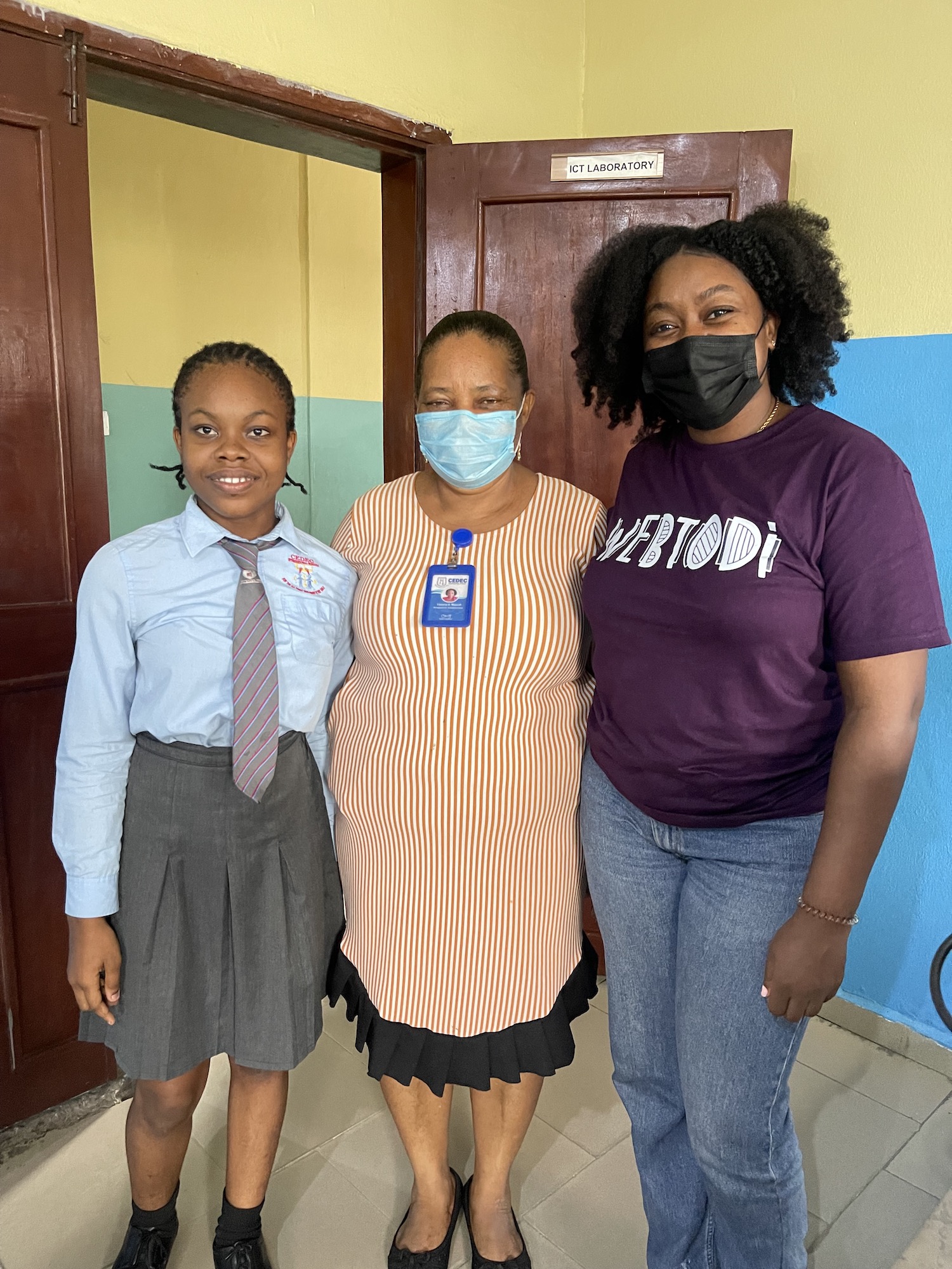
So far, WebTodi has been able to capture 3 students in its pilot phase, in an institution that could give us access to over 500 students. While we are still testing our prototype with users, we have secured 3 additional schools to conduct pilot tests of our first working solution.

Our Users

Before we started designing, we researched existing behavioral and purchase data of our potential users to understand them better. We also conducted a series of customer interviews. We focused on identifying what students are experiencing as their main pain points. We defined 2 user archetypes and mapped them to their respective actions.

The Opportunist: He/She is interested in getting opportunities that require less money spent. They want to know what deals are available right now.

Action: When I want to look for schools, I need to know that I can save money with scholarships, and get free content frequently.


The Discoverer: An early adopter seeking guidance on their higher education journey. They want to find out what the platform has to offer and will pay for the pleasure.
Action: When I’m interested in searching for higher education, I want to be able to see options tailored to me, so that I can track my applications and get access to many tools.

Process

Design Sprints

We conducted design sprints to facilitate collaboration across departments. Product Designers, Product Managers and the Business team contributed their fresh ideas in this sprint. The purpose of these sprints is to align everyone on the same goal—To improve our consumer experience by solving our user’s problems today.

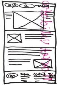
Sketches

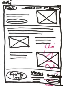
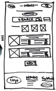
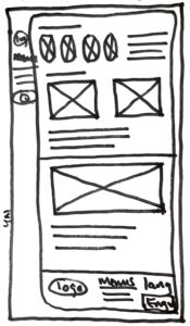
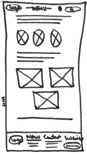
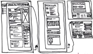
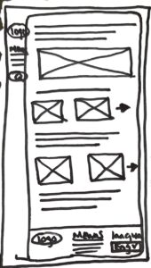
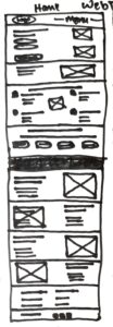
I sketched multiple user flows to visualize ideas quickly. My focus at this stage is get the ideas out quickly to aid design. Here are some early sketches of the Profile page.

Early Designs

A sneak peek into my early wireframes, mid-fidelity designs and drafts. The designs have gone through at least 30 iterations per screen. Some of the reasons for this are: Change in business direction, covid-19, shift in product roadmap or simply to improve the user experience.

Homepage

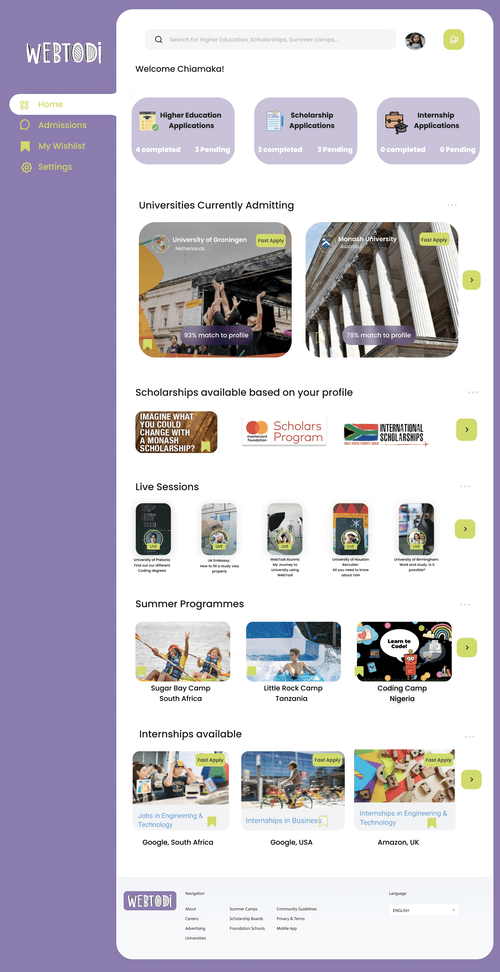
We want our home page to be personalized to each user. These are the various designs I’ve tried and did not make the cut. It could be due a number of reasons like unclear value proposition, cluttered designs, and lack of scalability.


University Search

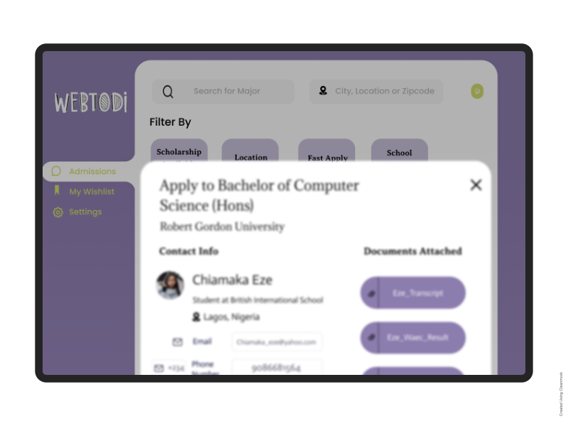
The university search page should be focused on presenting users with information relevant to their current path. One of our main focuses was having users determine what they want to do with their search. It was important for these filters to be included at the beginning of the page so the results would indicate a single purpose. This is why we didn’t overwhelm the user with too much content on the search page.


We developed over 50 iterations

The initial designs went through several user tests, discussions with operations, and business teams to ensure we have a friendly and scalable user experience. Unfortunately, I can’t show you every single part of the process.

Usability Testing & User Interviews

So far, WebTodi has been able to capture 3 students in its pilot phase, in an institution that could give us access to over 500 students. While we are still testing our prototype with users, we have secured 3 additional schools to conduct pilot tests of our first working solution.

Final Designs

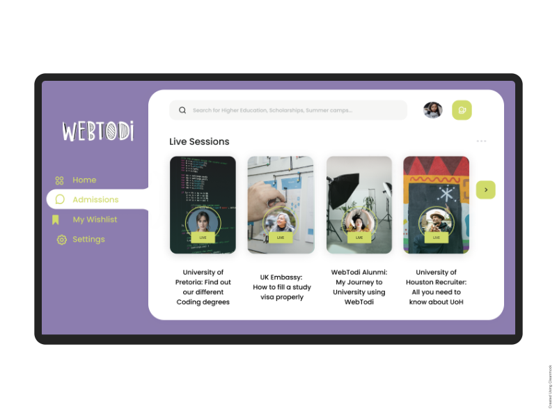
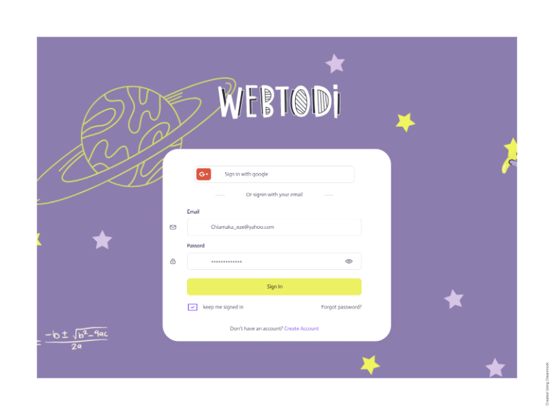
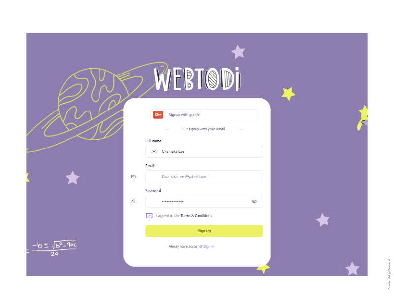
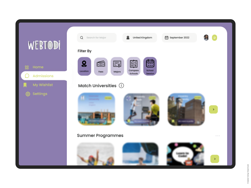
Here’s a detailed walkthrough of the WebTodi platform.


Looks refreshing, feels like the start of a journey.

While creating our wireframes, the platform was cluttered, it wasn’t focused on our core product offering. Now, WebTodi has a fresh new modern look and a clean experience. To give our product a positive perception, we introduced scalable components and designed simple interactions.

Our Learnings

Adapt to changing consumer behaviour

We needed to stay focused on the goal, but also account for changes to the product to match the behaviour of our potential users.

Take it one step at a time

We learned to break down complicated designs into small, manageable chunks. This eases development and allows us to visualize problems at a much faster rate.

Future

Post-launch optimization

This is an important next step for every UX improvement or product launch. With our product set to go to beta soon, we are constantly working on improving the design. With informed, actionable insights, we are focused on delivering a better experience for our consumers.

Keep designing streamlined experiences

Keep focusing on our product roadmap and stick to clearly defined design principles.